Rebranding the Right Power Forward
brand design & strategy
utilities & commodities
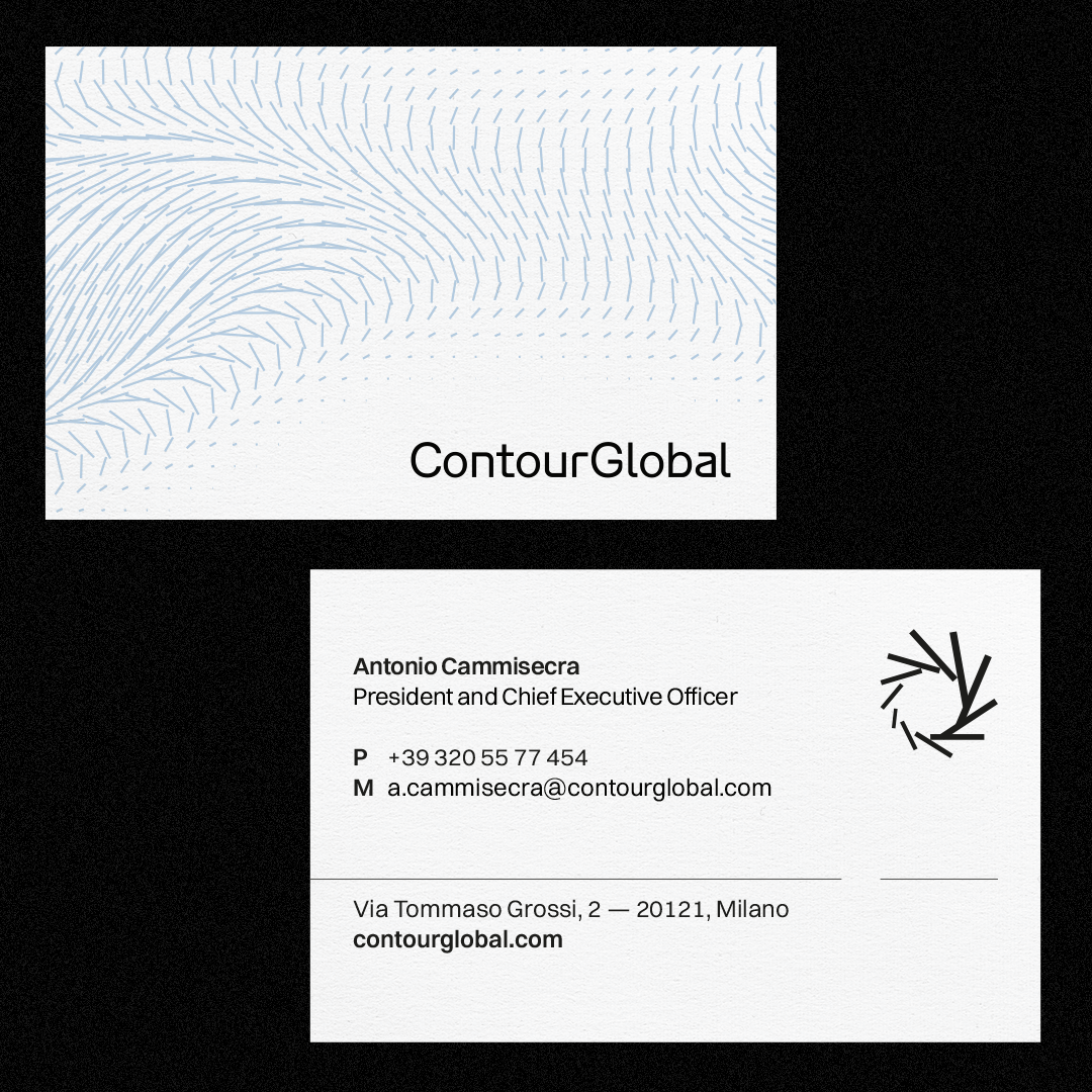
For ContourGlobal, we refreshed the entire brand identity and evolved the logo to reflect their forward-thinking vision. A clean, modern system built to amplify their positioning:
From grid and lines flows a quiet energy, shaping complexity into a new world of form.
Behind the scenes: the creative session we organized a workshop with the full team, combining individual and group activities to break the ice and kick off the design phase.
We had a good time :)
In our first design phase, we identified a set of contrasting parameters to define the look and feel of CountourGlobal’s brand identity.
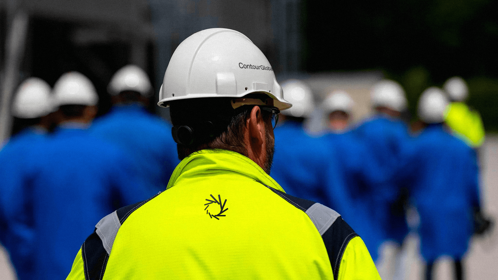
This visual language reflects the company’s ability to bring structure, expertise, and clarity to complex and sensitive energy processes.
The grid becomes the core system: a solid framework that organizes complexity and guides informed decisions.

Once the core system was defined, we looked to energy sources, symbols of transition and transformation, to shape the brand’s motion principles.
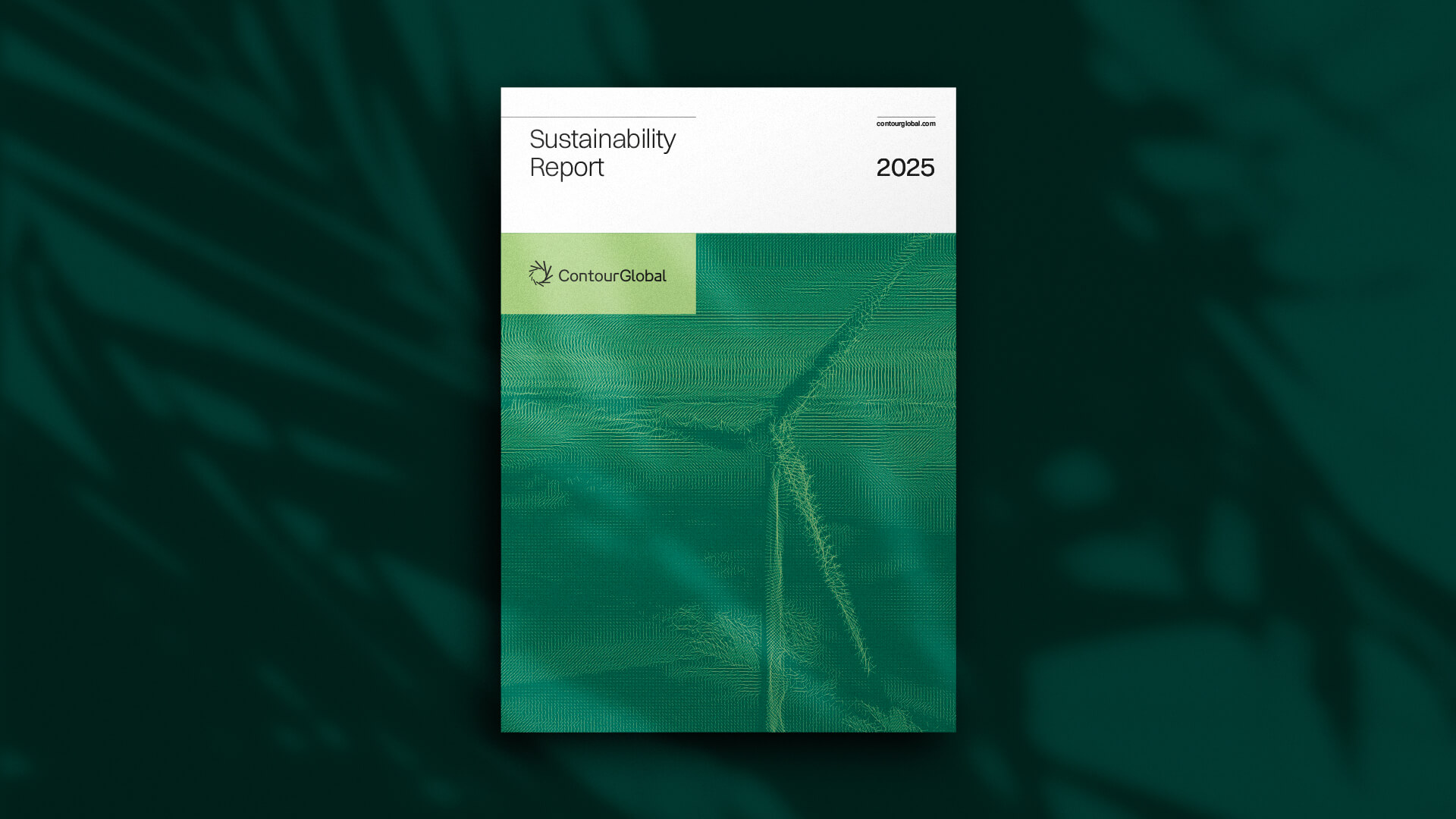
Colors aligned with the brand’s communication pillars.

The website is one of the most important touchpoints for brand storytelling.
It’s where a brand’s identity comes to life, forming a strong bond between visual elements and informational content.
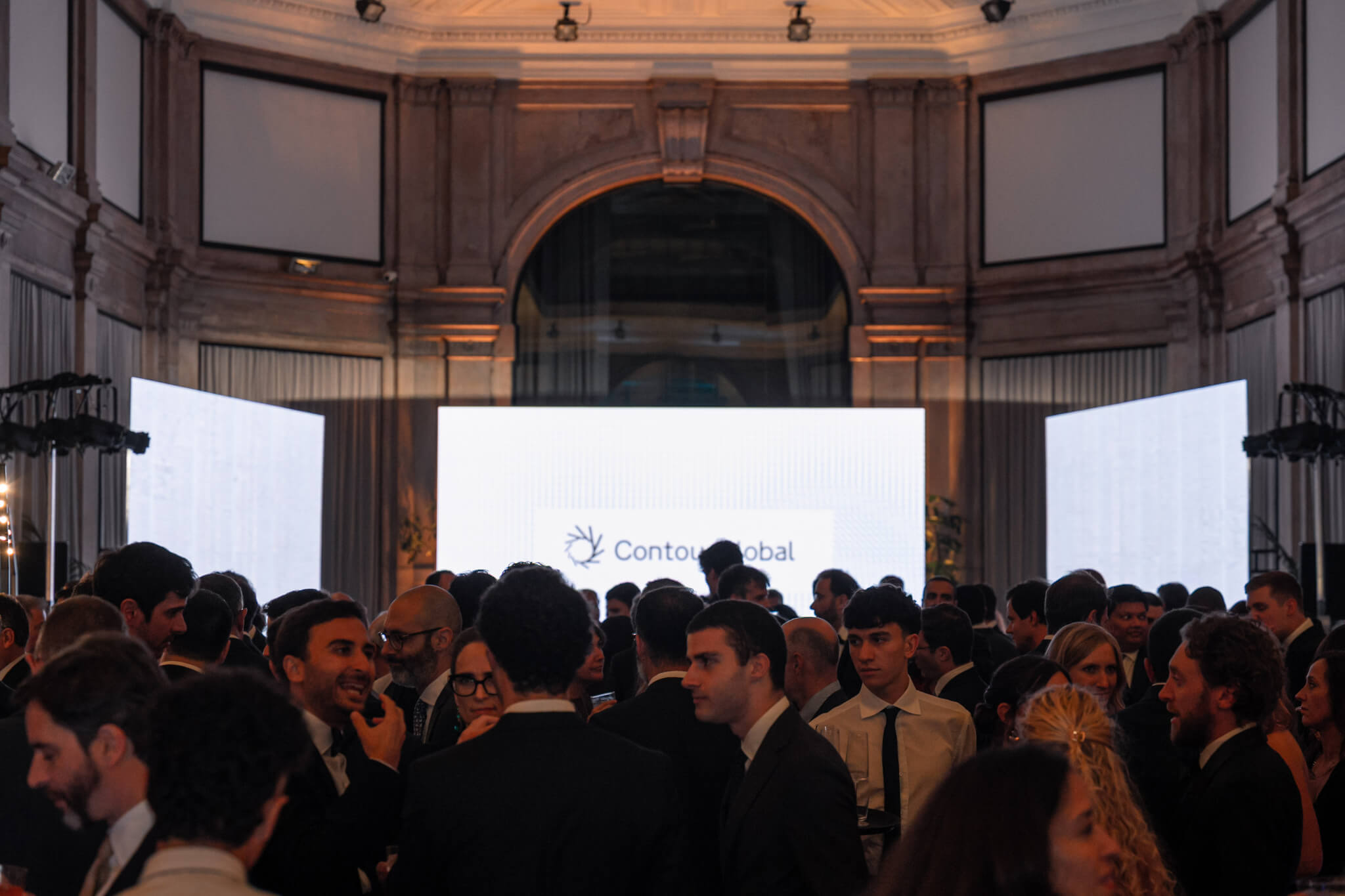
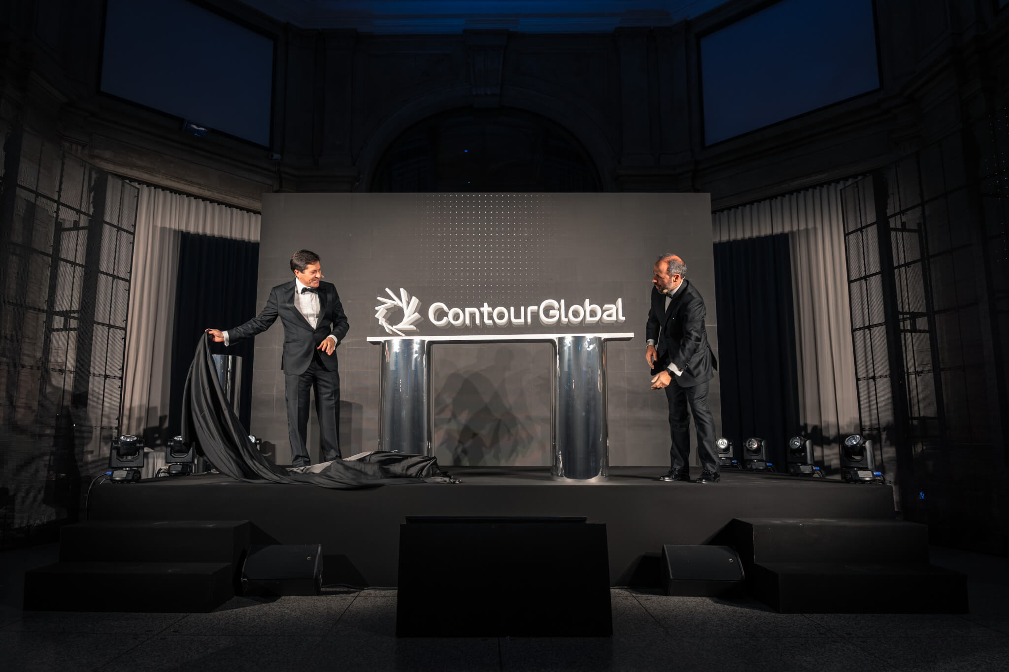
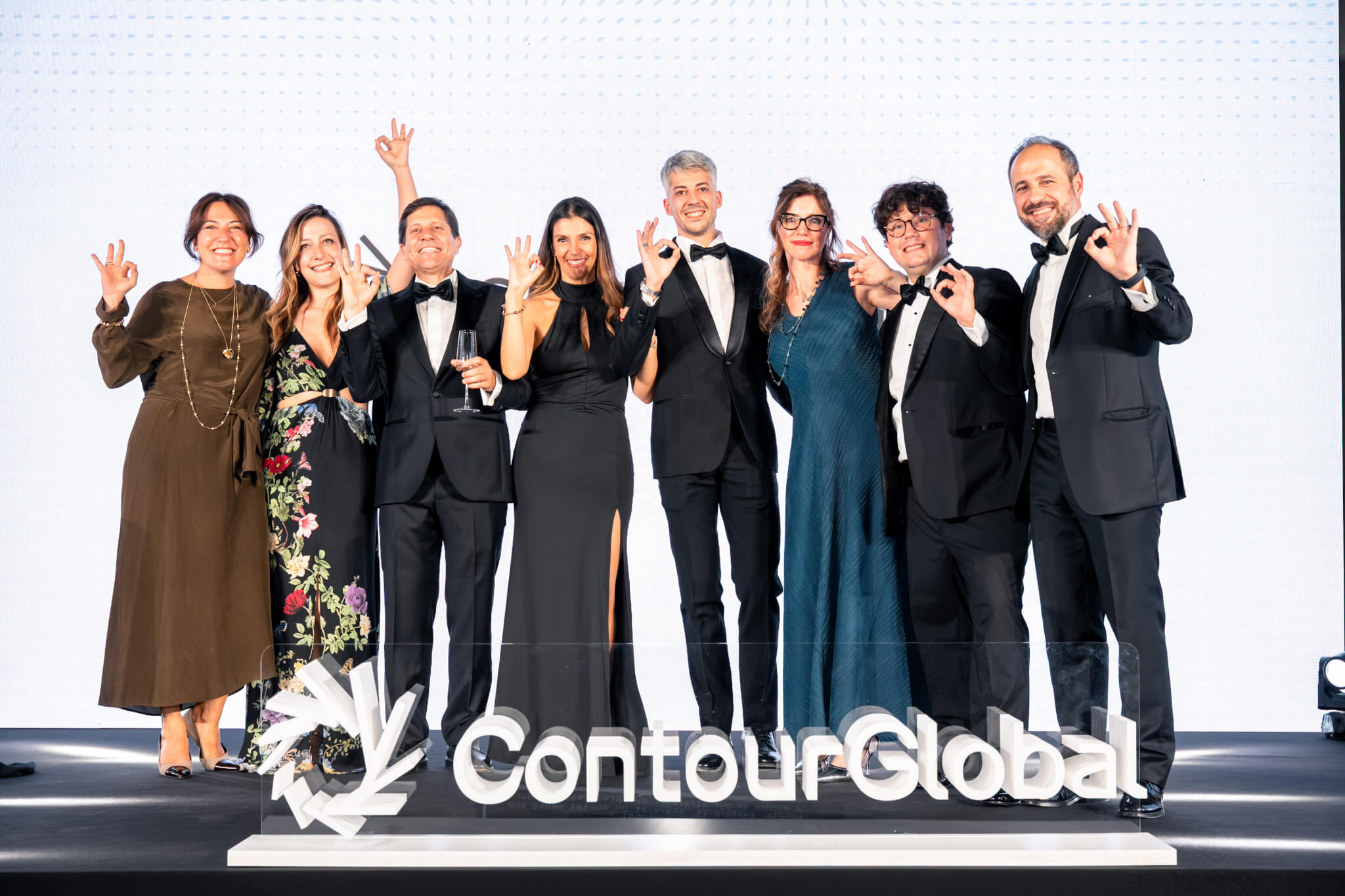
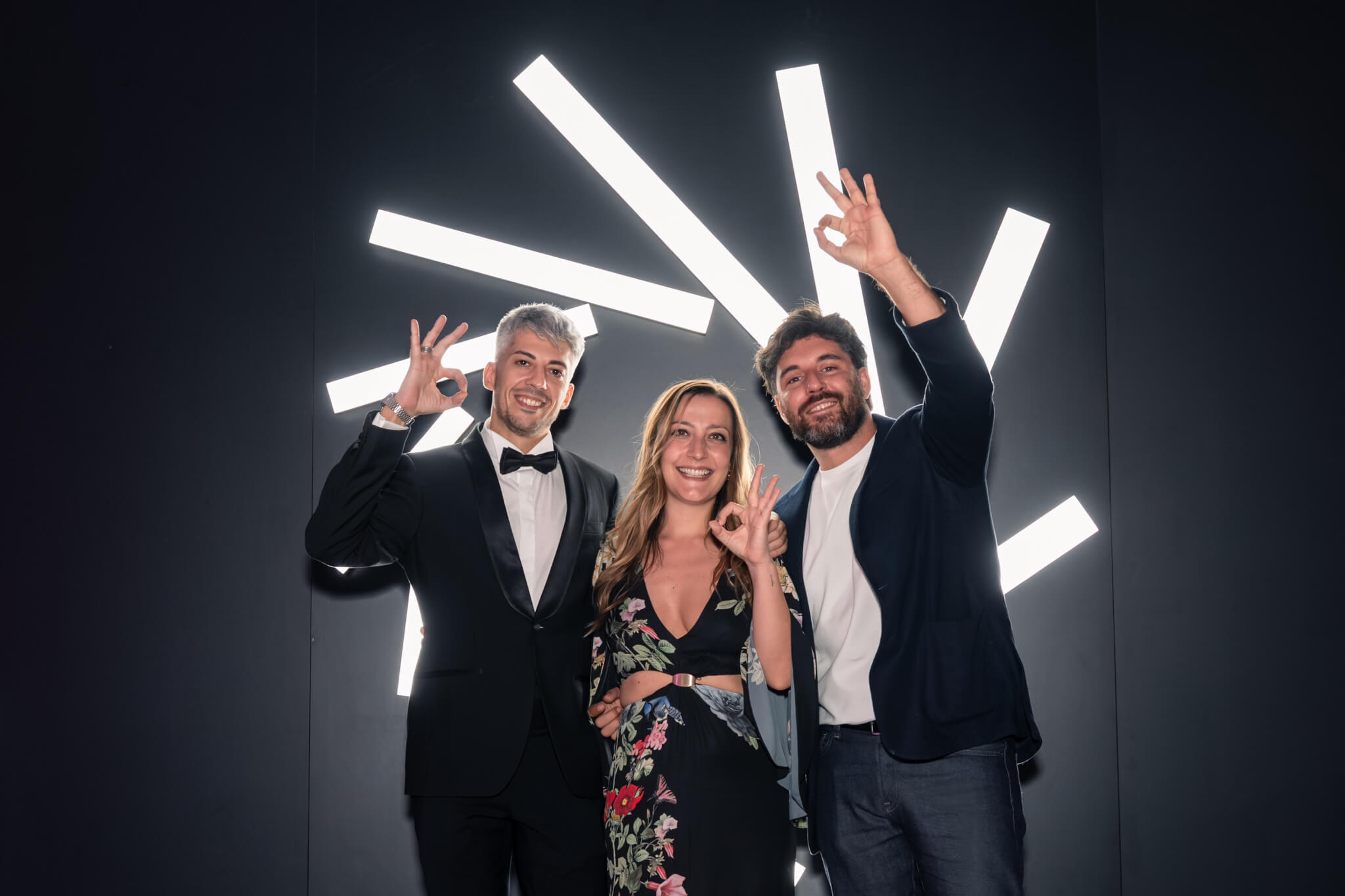
We had done a lot of work, so we decided to celebrate with a big party together with our friends at ContourGlobal :)
Enel social & digital content
